Event identity
ResMania 2027: one conference, two brands, three ways to tell the story
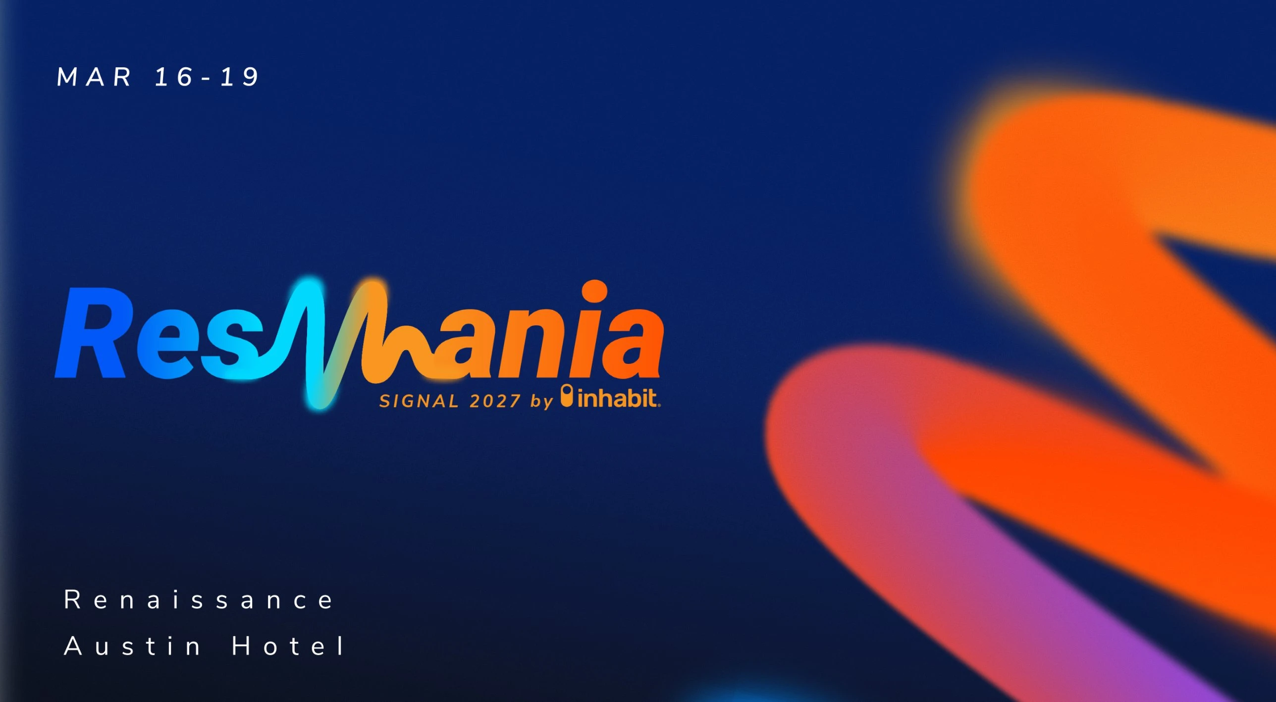
ResMan’s annual user conference had to carry two brand palettes without feeling co-branded. I gave leadership three complete identity systems to choose between, so they were comparing whole worlds, not logos.
The problem
Two brands, twelve colors and one stage. The identity had to feel like a single event, not a lockup of two logos.
ResMan brings bright blue, orange and purple. Inhabit adds its own orange, insurance blue and purple. Mixing them naively produces visual noise, but picking one side alienates the other. The system also had to work from a 1080-pixel speaker card up to a hanging banner.
- ResMan Blue#04A6E1
- ResMan Orange#FF4E00
- ResMan Purple#541F99
- Inhabit Orange#F79520
- Insurance Blue#0058F6
- Midnight#212A40
Approach
Merge the palette, then let Midnight hold it together
I set both brands’ colors against one deep navy, Midnight #212A40, so they read as a single spectrum. Reflex Pro Bold handles display type, and Roboto and Nunito Sans handle text.
Give each direction a single graphic device
Direction A uses a ribbon of light, B a stage-scale “Future proof” type gesture, and C concentric signal arcs. Each direction has one idea, and everything else stays quiet.
Test every direction on its hardest surfaces
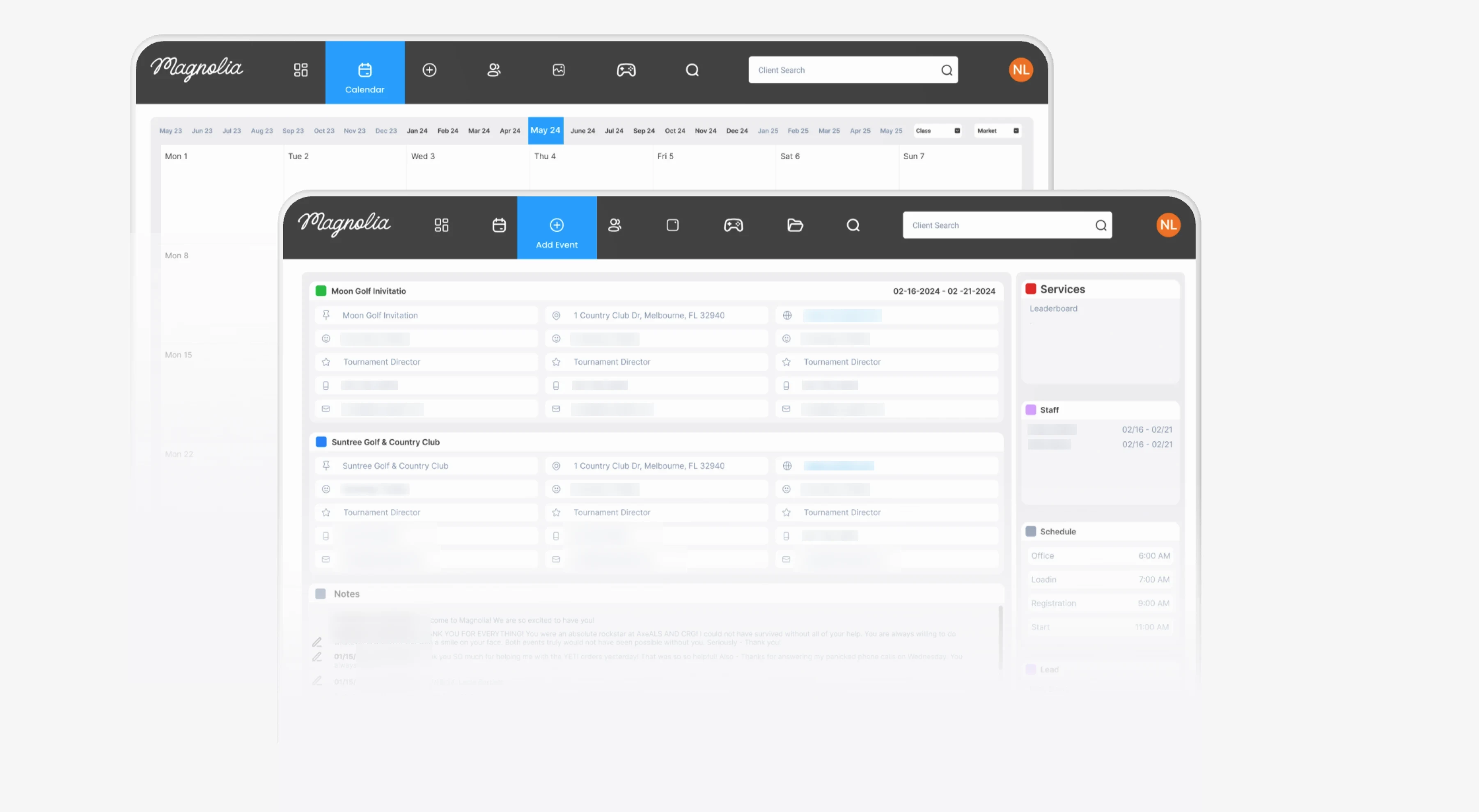
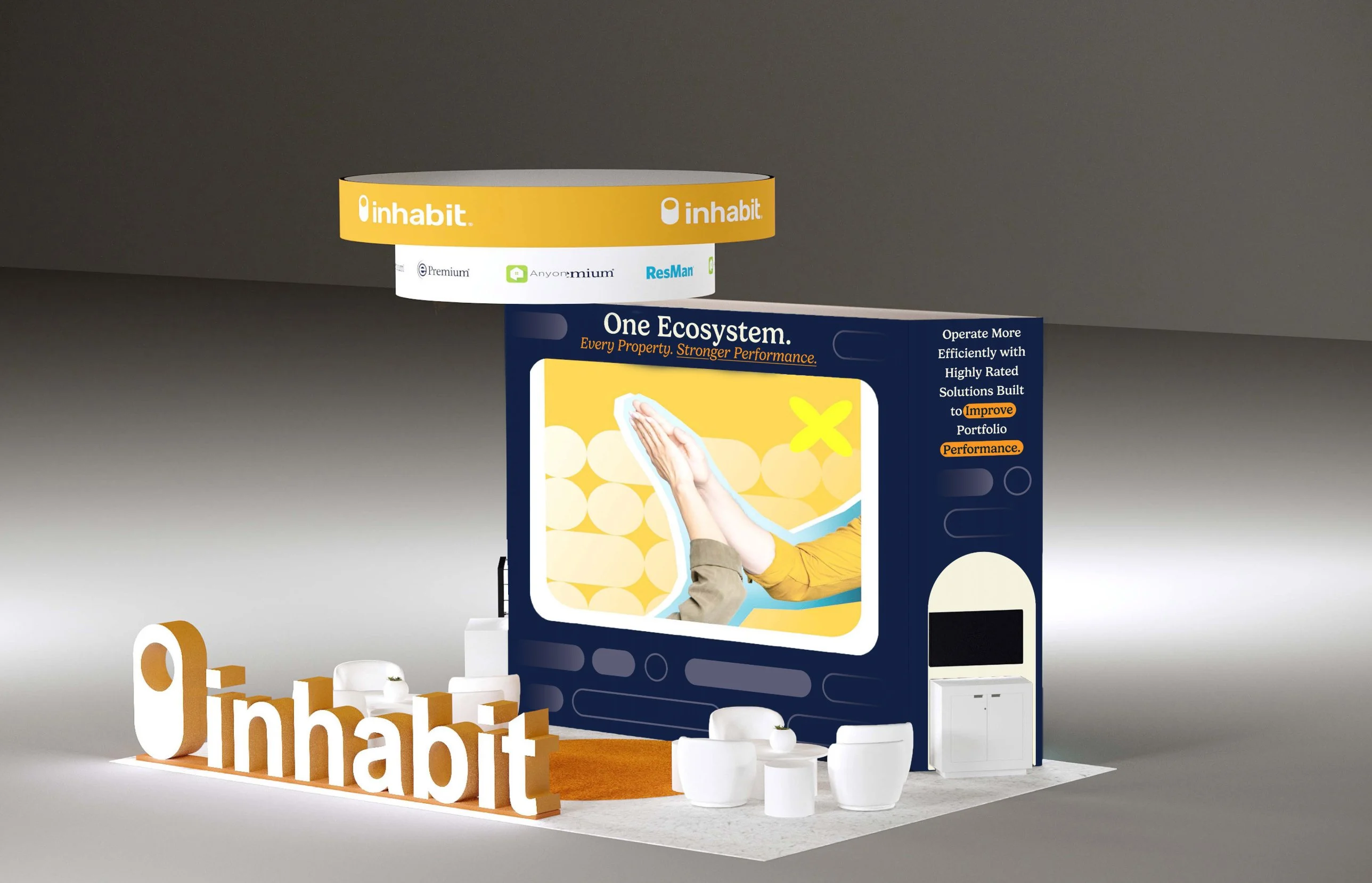
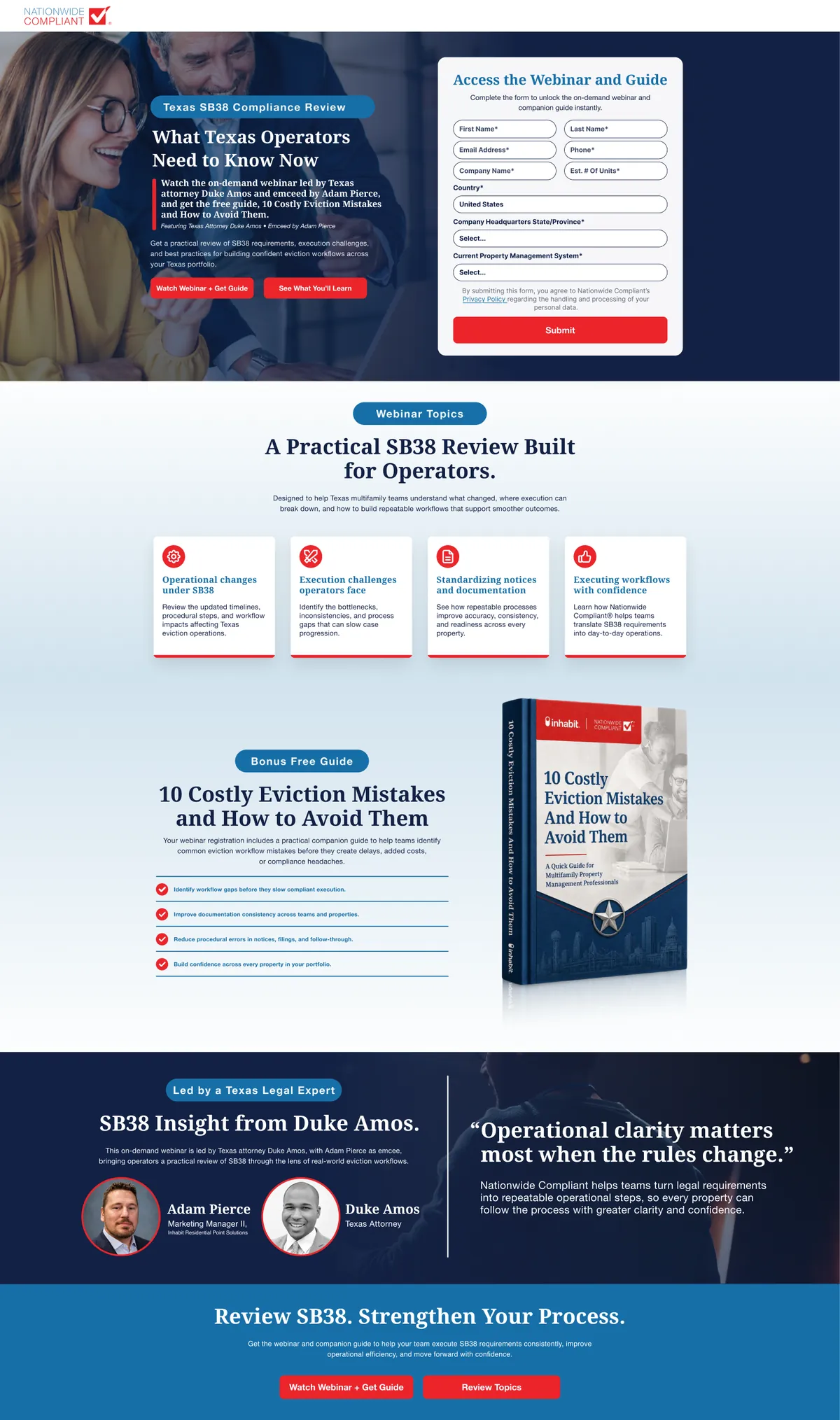
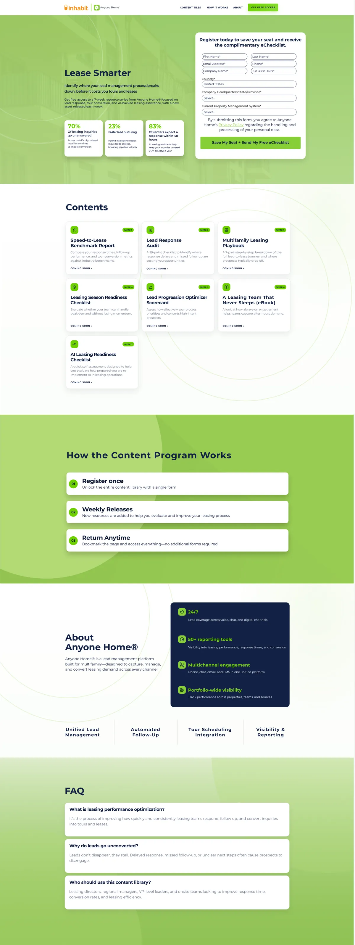
I built hanging banners, Speaker, Staff and Attendee badges, social speaker cards, stage screens and print for all three directions. A direction that only works as a poster isn’t a system.
Direction A: Signal, the ribbon
A single path of light from orange to blue that stands for signal turning into action. It works as well on a badge as it does on a 30-foot banner.
Direction B: Amplify, future proof
A louder, keynote-first direction with oversized type, a single orange field and the ribbon at stage scale.
Direction C: Signal · Insight · Action
The calmest and most editorial direction. Concentric arcs work like a sound wave, paired with an all-caps RESMANIA wordmark.
The full presentation boards
These are what leadership reviewed: each direction from concept to colors, type, photography and applications. Scroll inside each board.

A · Signal
Ribbon, merged palette, badges, social

B · Amplify
Stand-alone logo, social, print marketing

C · Signal · Insight · Action
Inspiration, colors, typography, photography
What I delivered
Leadership chose from three working systems instead of three logos.